
Product page: 7 elements that make the difference for conversion
The product page is where the sale happens. Seven elements to check so a hesitant visitor becomes a customer.
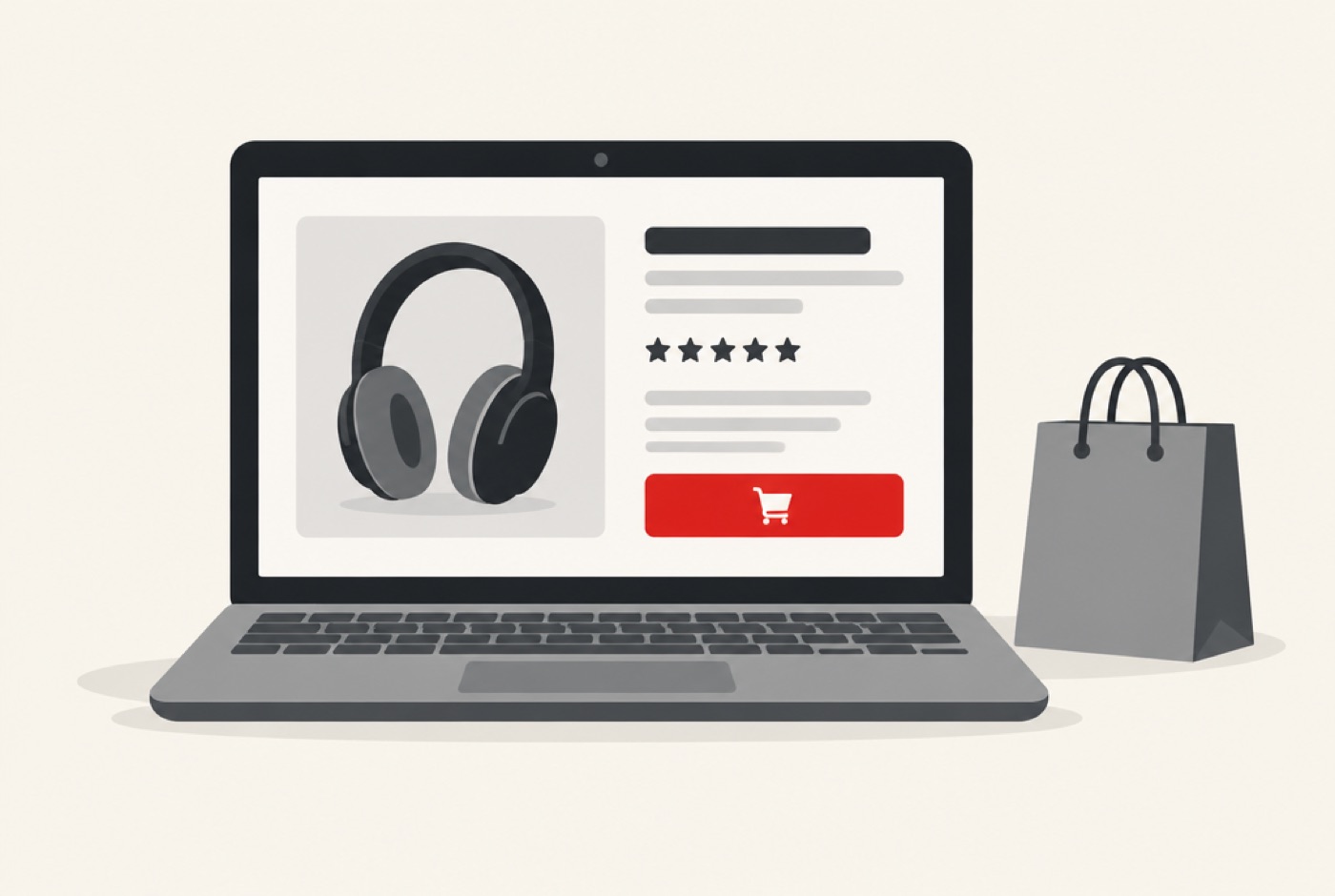
You can have excellent traffic and very few sales if your product pages leave visitors in doubt. The product page is where the decision is made: it is where the customer wonders whether the item matches their expectations, whether they can trust you and whether to order now or later. Anything that stops them from answering "yes" is a reason to leave the page.
The good news is that the same elements come back from one store to another. Here are seven points to check, in the order the customer looks for them, followed by the most common mistakes and a simple method to improve your pages without redoing everything.
1. Images that answer questions
Online, customers cannot touch the product: the images must do it for them. A single photo is never enough. Plan several angles, a close-up of the details and material, the product in use to give scale, and if possible a short video. Images must be sharp, well lit, consistent from one product to the next and large enough to allow zoom.
Think of concrete questions: what is the real size? How is it worn, opened or stored? What is the exact color in daylight? Every image that answers one of these questions removes a hesitation.
2. A clear title
The title must state the product name, its category and what sets it apart. Avoid abstract or purely poetic titles: visitors must know in one second whether they are in the right place. A good title also serves search ranking, since it is one of the first elements search engines read. Include the phrase your customers actually use to search for this product.
3. Benefits before features
"Keeps your drinks cold for 24 hours" speaks more than "double-wall stainless steel insulation". Present the benefit first, meaning what the customer will gain, then the technical feature that explains it. Features justify, benefits create desire. Keep a short summary visible at the top of the page, and the detail further down for those who want to dig deeper.
4. Proof
A visitor who does not know you looks for trust signals. Verified customer reviews, average rating, customer photos, press mentions, certifications, number of orders delivered: anything that shows others have bought and are satisfied. Place reviews near the buy button, or at least with a direct anchor link from the rating shown under the title.
Do not be afraid of leaving a few average reviews: a store that shows only five stars looks suspicious. Answering critical reviews courteously is proof of seriousness.
5. Answers to objections
Barriers to purchase are almost always the same: delivery times and costs, return possibility, payment methods, guarantees, payment security. Place this information close to the buy button rather than on a hidden page of your menu. A short reassurance block with three or four mentions ("Estimated delivery", "Returns accepted within X days", "Secure payment") is often enough to remove the final hesitation.
6. An obvious buy button
The "Add to cart" button must be visible without scrolling, including on mobile, contrasted with the rest of the page, with explicit text. One main button per page: if several actions of equal importance compete, the visitor no longer knows which to choose. On mobile, consider a buy bar that stays visible while reading the description.
State clearly the choices to make before purchase (size, color, quantity) and show availability immediately: nothing is more frustrating than discovering after filling a cart that the item is sold out.
7. A fast page that reads well on mobile
Most visits now come from a phone. A page that takes several seconds to display loses visitors before they have even seen the product. Compress images, avoid unnecessary elements that slow loading, and check that nothing moves during display. Test your page on your own phone, on a mobile connection rather than wifi.
A good product page anticipates every doubt before the customer needs to ask.
Structuring the page for quick reading
Visitors do not read, they scan. Help them find what they are looking for:
- A top area that groups image, title, price, reviews, options and buy button.
- Clear subheadings to separate description, features, delivery and frequent questions.
- Short lists rather than long paragraphs.
- A related products section, for those who did not find exactly what they wanted.
Price and how it is presented
Price is not just a number: its presentation influences perception. Display it clearly, with the currency, and state what it includes. If you run a promotion, show the old price crossed out and the saving made. Be transparent about extra costs: those that only appear at the last step are one of the main causes of cart abandonment. If you can, offer several payment methods, including your customers' usual ones.
Common mistakes
- Hiding shipping costs until the last moment.
- Reusing the supplier's description: it is identical to dozens of other stores.
- Adding several buttons of equal importance.
- Forgetting to test on mobile.
- Using photos of uneven quality from one product to another, which gives an amateur impression.
- Leaving pages without reviews or proof, and doing nothing to obtain them.
A simple method to improve your pages
No need to redo the whole store at once. Start with your most visited or best-selling products, because each improvement there will have the most effect. Open the page on your phone, note what makes you hesitate as a buyer, then fix in this order: the buy button, delivery information, reviews, images, description. Measure the add-to-cart rate before and after, and apply the same method to your other pages.
Once you have found what works, create a page template and keep it for all your products: consistency reassures and saves precious time with each new listing.
Frequently asked questions
How many images do you need per product?
There is no magic number, but five to eight images generally cover the essentials: main view, other angles, details, use, scale.
Should you display negative reviews?
Yes, they strengthen the credibility of positive ones. Answer them calmly, offering a solution.
Is a video essential?
No, but it helps a lot for products whose use or size is hard to understand from a photo.
If your pages do not convert as they should, a quick audit often identifies two or three points to fix. At Lynkevo, we design and optimize online stores in this spirit, on Shopify, WooCommerce or custom-built. Let's talk about your store: we come back to you within 24 hours.