Static creatives: how to design an ad that stops the scroll
An ad image has a split second to convince. Here are the composition, message and testing principles that make the difference.
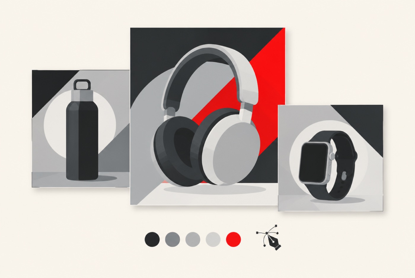
In a feed, your ad competes with dozens of other pieces of content: friends' photos, viral videos, competitors' ads. It has a split second to say "look at me". A successful static creative is not the prettiest one, it is the clearest one: it is understood at a glance, makes people want to know more and leads to a specific action.
Static creatives, meaning still advertising images, remain one of the most used formats in e-commerce because they are quick to produce, easy to adapt and simple to test. But they are judged within moments, and design mistakes are costly in ad budget. Here are the principles of composition, message, format and testing that make the difference.
What a good creative must achieve
A static ad has three successive missions. First stop the eye: without that, nothing else exists. Then make people understand in two seconds what it is about and why it is useful for the person looking. Finally make them want to act: click, discover, buy. If any one of these steps fails, the ad costs money without returning anything.
Think of each visual as a poster in the street: people see it in passing, they do not read it. Everything that is not essential must go.
One subject, one message
The most important rule is also the most often forgotten. Each visual must answer a question: what is this about, and why should I care? Choose one product and one benefit. If you want to talk about three things, make three visuals. Ads that try to say everything (novelty, promotion, delivery, quality and guarantee) get none of it across.
A good test: show your visual to someone for two seconds, then hide it and ask what they remember. If the answer does not match your intention, simplify.
Composition: guiding the eye
The eye follows a predictable path: it lands first on the largest, most contrasted or brightest element, then moves down to the next. Build your composition with that path in mind.
- An obvious focal point: generally the product, sharp and well lit.
- Space around it: emptiness is not a loss, it gives breathing room and highlights the subject.
- A clear hierarchy: the product first, the hook next, the button or offer last.
- Simple alignment: avoid scattered elements that hold attention in several directions.
Contrast to stand out
In a feed full of images, what attracts the eye is what is different. A plain background and a sharp product, an unexpected viewing angle, a well-chosen accent color in a sober palette: contrast is your best ally. Look at the ads in your sector and ask how not to resemble them. If everyone uses light backgrounds and centered products, a dark background or an off-center composition will set you apart immediately.
Make sure you stay consistent with your brand, though. A creative that does not resemble your store creates a break when the visitor clicks: they must recognize the world they arrive in.
Short, readable text
A few words are enough: the main benefit, possibly a proof point. Avoid paragraphs, lists and small print. The text must stay readable on a small screen, in bright light as well as on public transport. Use a simple typeface, large enough, with strong contrast between text and background. Four to seven words for the hook is a good guide.
Phrase the benefit from the customer's point of view rather than the product's: "Softer hair in one week" speaks more than "Formula enriched with argan oil".
Elements that reassure
A stranger discovering your brand needs trust signals. Include one or two, without overloading:
- The product shown as it will be received, without misleading retouching.
- Discreet social proof: average rating, review excerpt, a mention of customer feedback.
- A clear offer if there is one: free delivery, trial, money-back guarantee.
- A recognizable identity element: discreet logo, brand colors.
The main types of creatives to test
To avoid repeating the same visual, work several angles:
- The product alone: sharp, well lit, on a simple background. The most readable, ideal for a first approach.
- The product in context: used in a real situation, which helps people imagine themselves with it.
- Social proof: a customer review laid out with the product photo.
- The comparison: before/after, or comparison with a usual solution, presented honestly.
- The offer: a promotion or benefit clearly highlighted, without damaging the brand image.
- The explainer: three key benefits as icons or short mentions around the product.
The right format in the right place
A square visual does not behave like a vertical one. Platforms display ads in different frames: feed, stories, search results, banners. Prepare at least square, vertical and horizontal formats, keeping the important elements in the center, away from the zones the interface covers or crops. Design the visual with these adaptations in mind from the start rather than cropping afterwards: the result is much better.
A creative is never finished until it has been compared with another one.
Test before you choose
Your intuition does not replace data. The most reliable method is to change one thing at a time: the image, the hook or the button color. If you change three elements at once, you will not know which made the difference.
- Launch two or three variants with the same budget and audience.
- Let them run long enough to gather useful data, without concluding too early.
- Compare on an indicator that matters to you: cost per click, cost per purchase, landing page conversion rate.
- Keep the winner and create new variations around what worked.
Refresh before burnout
The same ad shown for a long time to the same audience eventually tires: performance drops although nothing changed about the product. Plan regular refreshes, keeping the concept that works and changing the packaging: new image, new hook, new framing. A series of visuals built around one concept is more effective than a succession of unrelated ideas.
Common mistakes
- Using too much text: the visual becomes unreadable on a small screen.
- Choosing a generic stock image: it looks like every other ad.
- Forgetting the call to action, or offering several that compete.
- Changing five things at once: you then cannot tell what made the difference.
- Neglecting the landing page: a good creative leading to an unrelated page wastes the click.
Where to start this week
Take your best product and produce three versions of the same visual: one with the product alone, one with the product in use, one with customer proof. Run them with the same budget and audience for a few days. Keep the winner and build the next series from it. In a few weeks, you will have a library of visuals that have proven themselves.
Frequently asked questions
How many variants should you test?
Two to three are enough to start. Beyond that, the budget is diluted and results become hard to interpret.
Should you put the price on the visual?
It depends on your positioning. An attractive price or a clear offer can strengthen the message; for a premium product, the image and the benefit matter more. Test both.
Can you use the same visuals on every platform?
The concept yes, the format no. Each platform has its own frames and habits: adapt the same concept into several formats rather than reusing the same image everywhere.
At Lynkevo, we design series of ad visuals for e-commerce brands: one concept, several adaptations, ready to be tested in your campaigns. Request a free quote and we will come back to you within 24 hours.